
Stepping into the unknown
Six design principles for creating immersive interfaces in the metaverse
A starting point for designers wanting to form experiences for the new digital age.
As part of our R&D efforts, we have been exploring what the metaverse is, what it may become, and how we will need to approach it in the future.
Currently, the metaverse is really a concept. It represents a future experience that seamlessly blends the digital and the physical into a mixed reality. With any emerging technology, there is a risk of misuse by both its creators and its users. We are concerned about technologies, like the metaverse, becoming another gimmick in our ever-changing world, which is why we asked ourselves how we can design for these environments, and how we can make sure we are not alienating users in the process.
To try and answer these questions, we embarked on the task of encapsulating all our learnings in six digestible design principles, which might help you create better and more accessible experiences in the metaverse (when the right time comes).

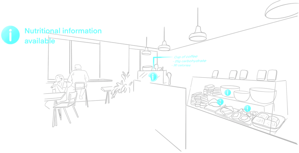
Clarity and readability should be at the forefront
When data is displayed in a way that is either not accessible or ill-considered, it can create a poor user experience that people do not want to engage with.
Keep UI styles consistent, simplify interaction patterns and consider changing backdrops to support user’s vision.

Data should feel empowering and not a distraction
Too much data on a page is often overwhelming to users and becomes a distraction rather than a point of focus.
The real time data layer should only contain visualisations of the data that are necessary to help them meet their needs. Theme styling should be kept to a minimum. Pop-ups should be limited to show essential information only, and ideally based on established preferences.

Control should be in the hands of the user
With so much available data, what information users are shown should be driven by them. Consider ways to expand information, such as the use of icons, if the user wants to access it.

Redefine ways to layer information
As we move into a new era of innovation, we need to find new ways to layer information suitable to an immersive environment. Therefore the hierarchy of information and how it appears to users will need to shift too. As an example, consider smart placement of HUD elements within users vision and the placement of secondary information in users peripheral vision.

Keep the user informed and updated
Always start with introducing users to their environment to create a familiar starting point in which to receive information. The data displayed needs to keep the user informed, updated and adapted according to their specific and changing needs.

Push boundaries
Pioneering design comes when the boundaries are pushed. It’s important to keep exploring the new medium. Challenge existing ways of thinking; challenge your own thinking, and most importantly — keep having fun!


The metaverse is misunderstood in 2024
What if there is more to the metaverse than virtual headsets and legless avatars?
Change starts with a conversation